• Graphic Design
  • UX/UI
  • About
Menu

Thriving Artist Studio

Graphic Design | Illustration | UX/UI Design
  • Graphic Design
  • UX/UI
  • About

“Simplicity is not the goal. It is the by-product of a good idea and modest expectations.” 
― Paul Rand

Artboard 1 copy 6.png Artboard 1 copy 22.png Artboard 1 copy 18.png Artboard 1 copy 32.png Mesa de trabajo 1.png
11 copy.jpg 12 copy.jpg
Screen Shot 2017-07-20 at 8.01.40 PM.png Screen Shot 2017-07-20 at 8.01.22 PM.png Screen Shot 2017-07-24 at 8.15.36 PM.png Screen Shot 2017-07-20 at 8.01.54 PM.png Screen Shot 2017-07-20 at 8.03.22 PM.png Screen Shot 2017-07-20 at 8.02.10 PM.png Screen Shot 2017-07-20 at 6.19.14 PM.png Screen Shot 2017-07-20 at 6.15.55 PM.png Screen Shot 2017-07-21 at 1.58.08 AM.png
alphabet_calender2 copy.jpg alphabet_calender1.jpg alphabet_calender1 copy 3.jpg 2.2.jpg
17 copy 7 copy.jpg 17 copy 5.jpg 17 copy 2.jpg 17 copy 6.jpg

The Soilless Farmer Branding

My client, who owns an organic farm approached me to do branding and logo design for his brand. His brief included sustainable and organic aesthetic complimenting the fresh produce at his farm. I created a custom typeface for his brand and logo from scratch using the Glyphs App.

My typeface is called Soilless Typeface for the brand The Soilless Farmer which is a soil less indicative that will grow over 50 crops by using water intensive processes & nutrients instead of soil aimed for the diverse climate-concious Auroville community in Pondicherry, India. It is an amalgamation between the built and unbuilt, urban and organic, concrete and green. It is a condensed all upper-case sans serif typeface, with loopy middle body representing the juxtaposition between the lines and the curves. TSF is looking to start to grow their produce from next month for the local market. Produce includes different type of leafy vegetables, cherry tomatoes, chillies & potatoes. The packaging design comprises of a cooler box and recyclable vegetable pouches.

Artboard 1.png
Artboard 1 copy 11.png
4.png
3.png
Artboard 1 copy 27.png
5.png
6.png
7.png
Artboard 1 copy 5.png
Artboard 1 copy 16.png
Artboard 1 copy 17.png
Artboard 1 copy 14.png
Artboard 1 copy 15.png
Mesa de trabajo 1.png
Artboard 1 copy 6.png
Artboard 1 copy 13.png
Artboard 1 copy 18.png
Artboard 1 copy 25.png
Artboard 1 copy 26.png
Museum Font.png
Artboard 1 copy 20.png
Cafe Mockup Font.png
Artboard 1 copy 33.png

Illustration

‘Futur Proche’ is an exhibition that talks about the idea of ‘near future’ as imagined by an artist. In world of active geopolitical chaos, humanitarian and climate crises, what does the future hold for humanity? In this group show, I reimagine the near future as an artist keeping in mind factors that presently define our human existence.

Next Stop, Instability_Digital Illustration_12x11.2 inches_2022.png
Pill-apocalypse_Digital Illustration_12x12.67 inches_2021.png
Take A Will Pill_Digital Illustration_9x9 inches_2021.png

Polo Factory Website Design

I designed an E-commerce website for a brand called Polo Factory wherein I worked as a UI/UX designer and came up with beautiful and functional solutions to client's needs. Aesthetically, the website is clean, simple and sophisticated owing to the quality of products they're selling on their platform. The website is now successfully running and is a pioneer in India for Polo gear related online shopping.

Link: https://polofactoryonline.com/

Polo Factory Mockup.png
1@2x.png
My Wishlist@2x.png
PoloFactory Landing Page Copy 14@2x.png
PoloFactory Landing Page Copy 22@2x.png

PROOF: Media for Social Justice

Unearthed poster mock up.jpg
unearthed handout mockup.jpg
legacy copy copy.jpg
legacy tablet.jpg

Book Design

The Jack Donaghy Chronicle – A book on Jack Donaghy from the popular show 30 Rock showcasing his lifestyle through illustrations and hilarious quotes. 

JACK BOOK COVER.jpg
jack1.jpg
jack2.jpg
jack3.jpg
jack4.jpg
jack5.jpg
jack6.jpg
jack7.jpg
jack8.jpg

Web Design

Indian National Trust for Art and Architectural Heritage: Website design for an NGO in India that deals with restoration of art and architecture. These particular logo, identity and web designs are for INTACH Jodhpur wherein the color blue signifies the character of the heritage blue city of Jodhpur. 

The 'A' is in the shape of an architectural arch representing a very Indian aesthetical sense. The slight inclination of an Indian arch/ dome signifies the message that the NGO wishes to project.

The images used on the websites are of two art pieces that INTACH restored. There is an interactive slider placed on the images which shows the before and after the restoration of the images. 

Screen Shot 2015-03-22 at 3.02.30 PM.png
Screen Shot 2015-03-22 at 3.02.57 PM.png
Screen Shot 2015-03-22 at 3.05.11 PM.png
15.jpg
13.jpg
14.jpg

Typeface Designs

Font Fretwork: Typeface design inspired by the fretwork and geometric designs used in Art Deco style.


Font SansCrit: Typeface design inspired by Hindi script font.

deco copy.jpg
deco inspiration-1.jpg
alphabet_calender.jpg
abc2.jpg
card box.jpg
hindi.jpg
Hindi script.jpg
typefaces copy 2.jpg
pindi.jpg

LookBook 2015

Designed the Look Book for Urban Zen Spring-Summer 2015 "Harmony Collection." This involved cropping, retouching and laying images so as to maintain a consistent flow throughout the book complimenting the seasonal aesthetics. 

Urban Zen Harmony Lookbook SS 2015_Page_01.jpg
Urban Zen Harmony Lookbook SS 2015_Page_02.jpg
Urban Zen Harmony Lookbook SS 2015_Page_03.jpg
Urban Zen Harmony Lookbook SS 2015_Page_04.jpg
Urban Zen Harmony Lookbook SS 2015_Page_05.jpg
Urban Zen Harmony Lookbook SS 2015_Page_06.jpg
Urban Zen Harmony Lookbook SS 2015_Page_07.jpg
Urban Zen Harmony Lookbook SS 2015_Page_08.jpg
Urban Zen Harmony Lookbook SS 2015_Page_09.jpg
Urban Zen Harmony Lookbook SS 2015_Page_10.jpg
Urban Zen Harmony Lookbook SS 2015_Page_11.jpg
Urban Zen Harmony Lookbook SS 2015_Page_12.jpg
Urban Zen Harmony Lookbook SS 2015_Page_13.jpg
Urban Zen Harmony Lookbook SS 2015_Page_14.jpg
Urban Zen Harmony Lookbook SS 2015_Page_15.jpg
Urban Zen Harmony Lookbook SS 2015_Page_16.jpg
Urban Zen Harmony Lookbook SS 2015_Page_17.jpg
Urban Zen Harmony Lookbook SS 2015_Page_18.jpg
Urban Zen Harmony Lookbook SS 2015_Page_19.jpg
Urban Zen Harmony Lookbook SS 2015_Page_20.jpg
Urban Zen Harmony Lookbook SS 2015_Page_21.jpg
Urban Zen Harmony Lookbook SS 2015_Page_22.jpg

Poster Series

Paraiso - An event honoring the best works in Spain by some of the best architects covering over three different cities such as Valencia, Barcelona and Bilbao for this epic celebration of architecture. 

The posters capture various styles of architecture through subtle graphic portrayal of materials and forms used by each architect that best describe their expression. The subdued tones of images speak of the individual boldness of forms, as they are tied together by a common typographic system, which has a prominent personality of its own. 

paraiso.jpg
calatrava.jpg
gaudi.jpg
gehry.jpg
paraiso mock up.jpg

Exhibition Design

Humans – Exhibition design for Humans of New York fame artist Brandon Stanton's work at Hudson River Park, New York

Rotating Exhibition Panels display photographs of the people of New York on one side with their intriguing stories or anecdotes on the other. The idea was to host the exhibition in an open public space where people from all walks of life can view the show and reflect upon the character of the city they love so much.


Screen Shot 2015-03-26 at 1.07.06 AM.png
Screen Shot 2015-03-25 at 10.42.29 PM copy.jpg
Screen Shot 2014-10-20 at 3.10.32 PM.png
Screen Shot 2014-10-20 at 3.10.45 PM.png
Screen Shot 2014-10-20 at 3.10.59 PM.png
Screen Shot 2014-10-20 at 3.11.08 PM.png
Screen Shot 2015-03-25 at 10.42.48 PM copy.jpg
Screen Shot 2015-03-25 at 10.43.00 PM copy.jpg
Screen Shot 2015-03-25 at 10.43.18 PM copy.jpg
Screen Shot 2015-03-26 at 12.52.27 AM.png
Screen Shot 2015-03-26 at 1.08.13 AM.png
Humans Invitation.jpg
Screen Shot 2015-03-26 at 1.23.48 AM.png

Boutique Branding

Bee's Knees Baking Co. – Boutique Branding and redesign for a New York based bakery and lounge.

The concept behind the logo was derived from the name of the bakery. The sweetest honey is found on the bee's knees while it hops from flower to flower. The box that contains the name and illustration is a representation of an efficient hexagonal form of a honeycomb; also extensively found in the interior graphics of the bakery.

Bee's knees window .jpg
TYPE USES bee.jpg
bk1.jpg
bk2.jpg
bee's knees jars.jpg
IMG_4139 copy.jpg
sign board bee's.jpg

Annual Report Design

Designed, edited and helped copy-write for a New York based NGO called PROOF: Media for Social Justice which deals with visual storytelling for human rights and peace-building. 

Report Cover.jpg
Report Mockup0.jpg
Report Mockup1.jpg
Report Mockup2.jpg
Report Mockup3.jpg
Report Mockup4.jpg
Report Mockup5.jpg
Report Mockup6.jpg
prev / next
Back to Graphic Design
Poster2.png
23
Typeface Design
Pill-apocalypse.gif
3
Illustration
5
Polo Factory Website Design
unearthed handout mockup copy.jpg
4
PROOF: Media for Social Justice
JACK BOOK COVER.jpg
9
Book Design
Begum-gif.gif
6
Web Design
alphabet_calender.jpg
10
Typeface Designs
Urban Zen Harmony Lookbook SS 2015_Page_01.jpg
22
LookBook 2015
Screen Shot 2014-11-02 at 1.05.34 AM.png
5
Poster Series
mama's girl.jpg
13
Exhibition Design
Bee's knees window .jpg
7
Boutique Branding
Report Cover Solo1.jpg
8
Annual Report Design

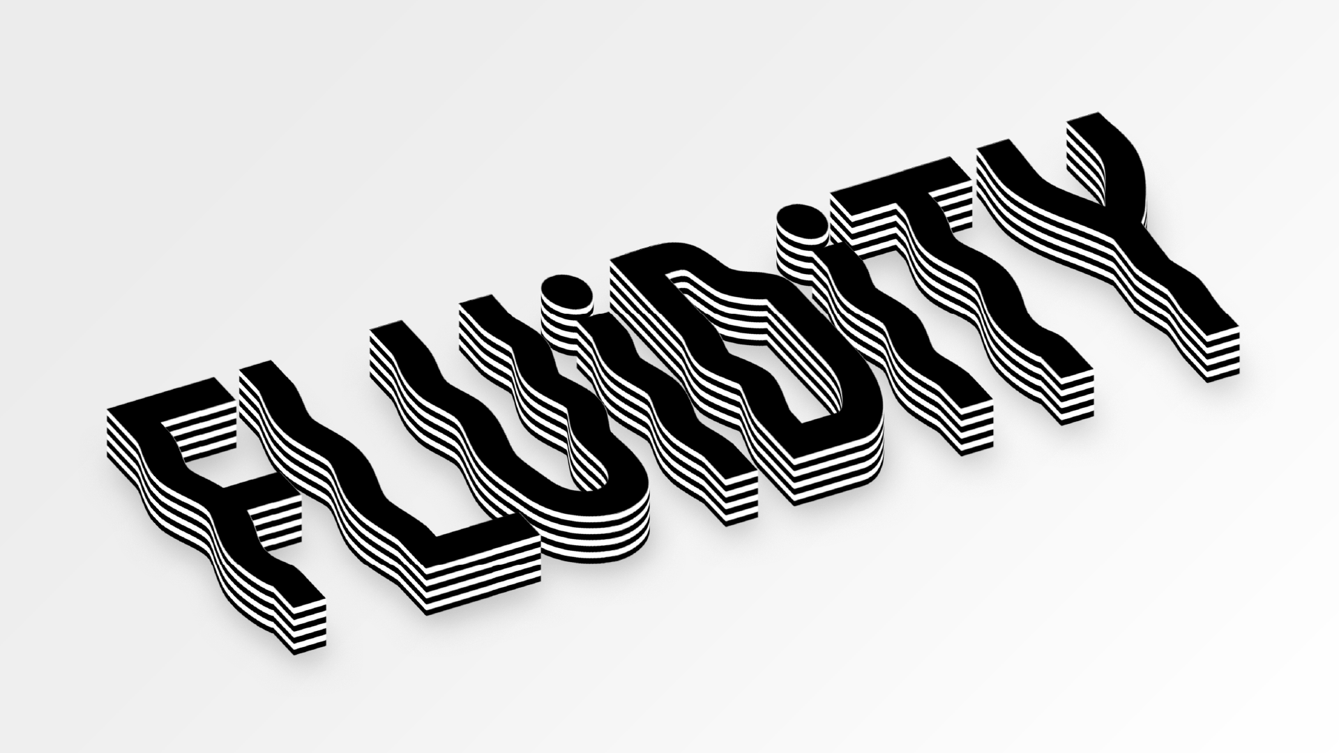
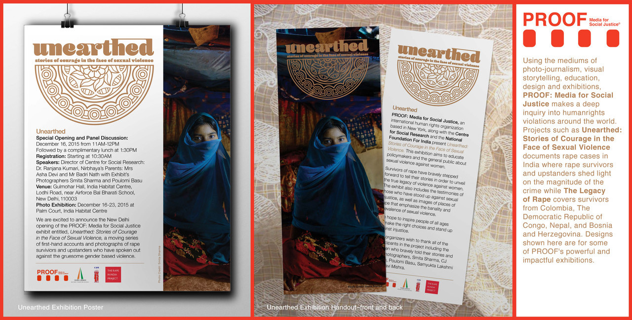
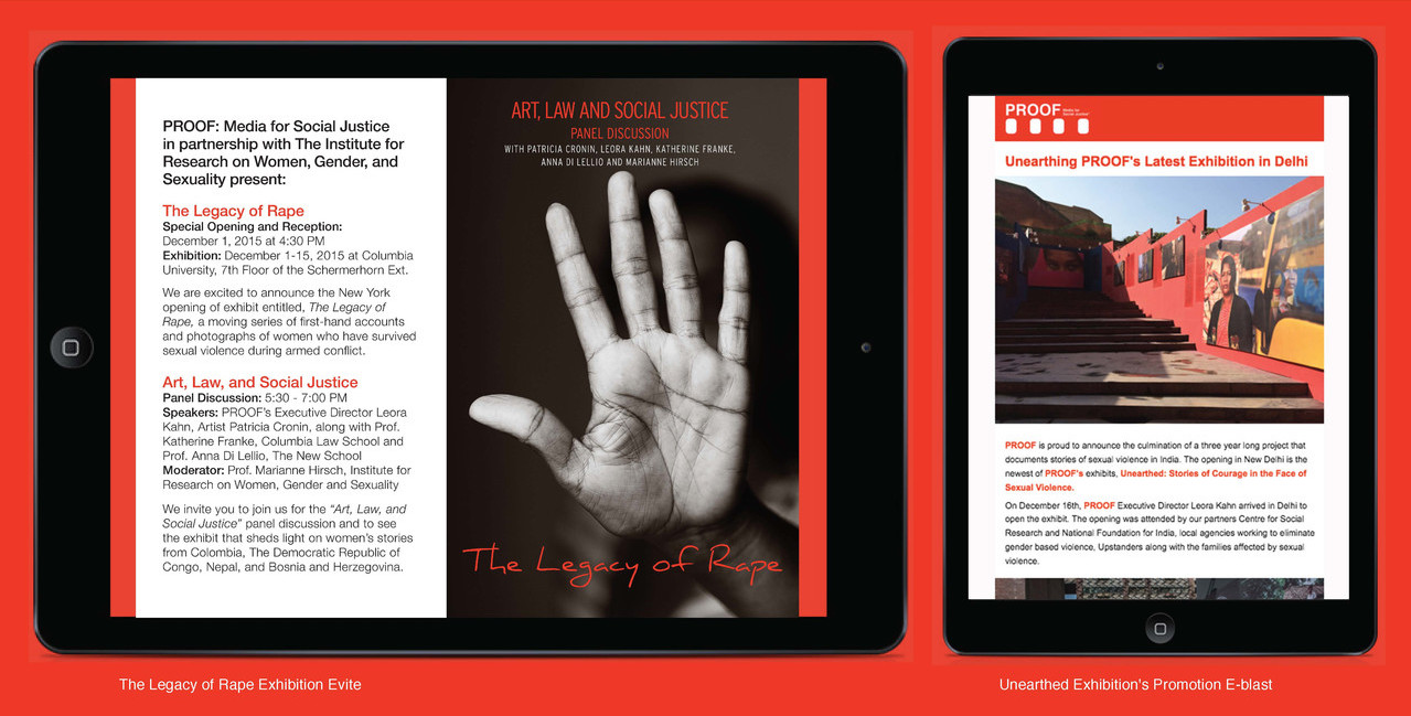
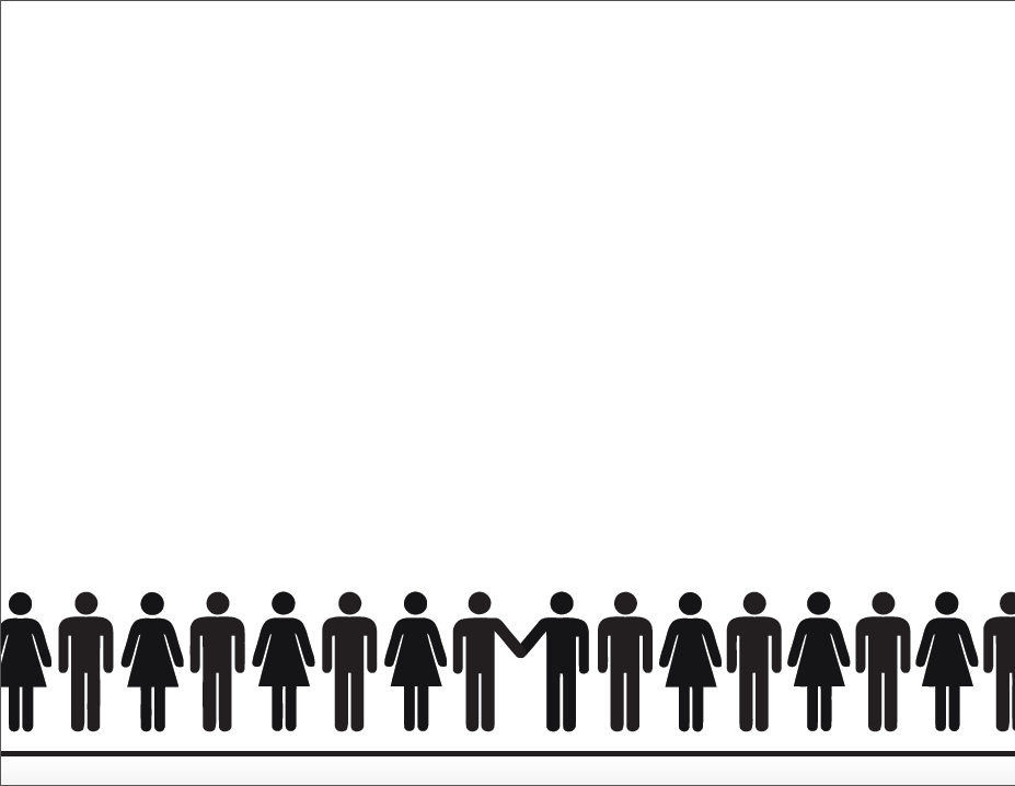
Interruption – The man-made interruptions that human societies face universally. Be it on the basis of race, religion, gender, class or caste. It doesn't end in any conclusion but is indeed a loop, this play of power and prejudice.

[Project Specifications – topic: interruption, duration: 1 minute video, mode: black and white]